Matching Flooring to Cabinet Colors – Designer Rules
Picking the right kitchen floor to go with your cabinets can make your space look special. With many color options available, knowing how to create either balance or strong contrast is important for a unified design. This guide explains how to match flooring with cabinets, providing advice from professionals to make sure your kitchen both looks great and feels welcoming. Learn how to smoothly mix matching colors to improve your home’s look.
Key Takeaways:
Contents
- Understanding Color Theory
- Interior Design Color Trends and Psychology Statistics
- Types of Flooring Materials
- Types of Cabinet Finishes
- Matching Strategies
- Practical Tips for Selection
- Common Mistakes to Avoid
- Frequently Asked Questions
- 1. What are some important designer rules to keep in mind when matching flooring to cabinet colors?
- 2. Can I mix and match different types of flooring and cabinet colors in the same room?
- 3. How can I create a cohesive look when choosing flooring and cabinet colors?
- 4. Should I match my flooring and cabinet colors exactly?
- 5. What types of flooring work best with dark cabinet colors?
- 6. How can I use various materials for my flooring and cabinet colors?
Importance of Color Coordination
Matching colors can improve how a kitchen looks and make it feel more connected, turning it into a main part of the home.
Colors have a strong impact on how people feel and how easy a kitchen is to use. Colors like red and orange can make people feel hungrier and more energetic, which is why they are great choices for kitchens.
Conversely, cool colors like blue and green promote calmness, ideal for kitchens used for dining. To improve these effects, think about using color psychology by painting walls in a single color, selecting matching decorations, or choosing cabinets that match the mood you want.
Tools like Sherwin-Williams’ ColorSnap allow you to preview different color choices, making it easier to choose a look that matches your lifestyle.
Overview of Design Principles
Knowing basic design principles like balance, contrast, and harmony is key to designing a good kitchen interior.
Balance can be achieved through symmetrical layouts, like placing matching pendant lights over an island, while contrast might involve mixing materials-like sleek metal appliances with rustic wood cabinetry.
In a modern kitchen, you might combine a simple quartz countertop with dark cabinetry, creating a strong visual effect. Alternatively, farmhouse styles often use soft, muted colors. For example, sage green cabinets combined with off-white walls, along with natural wood details.
These elements combine to create a unified and welcoming kitchen that shows your individual taste.
Understanding Color Theory
Learning about color theory can guide you in selecting the best colors for cabinets and floors, helping you design attractive color combinations that fit modern trends.
Interior Design Color Trends and Psychology Statistics
Interior Design Color Trends and Psychology Statistics
2025 Design Trends and Expert Opinions: Top Color Trends
2025 Design Trends and Expert Opinions: Preferred Colors for Selling Homes
2025 Design Trends and Expert Opinions: Off-Putting Colors and Trends
The Interior Design Color Trends and Psychology Statistics The dataset gives information on new color trends in interior design and how they affect people’s feelings, especially when selling homes. As we get closer to 2025, more designers and homeowners are paying attention to the colors they pick because these decisions can greatly affect the look and worth of a home.
2025 Design Trends and Expert Opinions highlight several key themes. A notable 60% of experts emphasize integrating nature into design, reflecting a broader trend of bringing the calming effects of the natural world indoors through color palettes that include greens, browns, and earth tones. This trend aligns with a growing desire for spaces that promote tranquility and mindfulness.
- Color Drenching: With 55% popularity Color drenching involves using different shades of one color throughout a room to create a unified and engaging atmosphere. This trend can make spaces look more interesting and appealing, giving them a modern and welcoming feel.
- Soft/Warm Whites: An overwhelming 85% agree that soft and warm whites add significant value to homes, particularly in main living spaces. These tones are favored for their versatility and ability to make a room appear brighter and more spacious, appealing to potential buyers.
Preferred Colors for Selling Homes echo these sentiments, with 85% of respondents favoring soft/warm white for main living areas, and 76% choosing warm neutrals for bedrooms. These choices are strategic, as they create a neutral backdrop that allows buyers to envision their own furnishings and decor, enhancing the home’s appeal.
Conversely, the dataset also identifies Off-Putting Colors and Trends. A significant 73% of buyers find lime green off-putting, and 42% feel the same about bold pink. Bright and intense colors can put off buyers as they might be overwhelming and not liked by everyone. It’s important to choose colors that most people will like.
In summary, the data illustrates a clear preference for nature-inspired and neutral colors, both for personal enjoyment and increasing a home’s market value. Knowing these trends helps homeowners and designers choose options that meet both style and function in the housing market.
Primary, Secondary, and Tertiary Colors
Primary colors form the building blocks of color theory, while secondary and tertiary colors allow for diverse options when matching cabinetry and flooring.
To effectively use the color wheel in kitchen design, start by identifying your primary color, like blue. From there, select complementary colors such as orange for accents or contrasting colors like yellow to create visual interest.
For example, if your cabinets are light blue, matching them with warm wooden floors and orange accessories can create a balanced and lively room. Try using sample swatches and digital design tools like Sherwin-Williams’ ColorSnap to try out these combinations before deciding.
Warm vs. Cool Colors
The choice between warm and cool colors can dramatically influence the ambiance of your kitchen, determining its overall warmth or freshness.
Colors like red and yellow make a space feel welcoming, which is perfect for having family over or enjoying a comfortable meal. For example, a light buttery yellow can brighten the room, giving it a spacious and happy atmosphere.
In contrast, cool colors like blues and greens evoke calmness and cleanliness, perfect for modern kitchens. A pale blue backsplash can lend a refreshing touch while enhancing the kitchen’s spaciousness.
Mix the two styles for balance; use warm touches with cooler wall colors for a unified look. For those planning home renovations, worth exploring: our insights on flooring pattern effects and how they contribute to the overall aesthetic.
Neutral Colors and Their Versatility
Neutral colors create a simple foundation in kitchen design, allowing easy pairing with various cabinet and floor styles.
Popular neutral shades like soft beige, crisp white, and cool gray provide a calming backdrop that pairs beautifully with other colors.
For a strong visual effect, try highlighting these neutral shades with deep navy blue, bright yellow, or dark forest green.
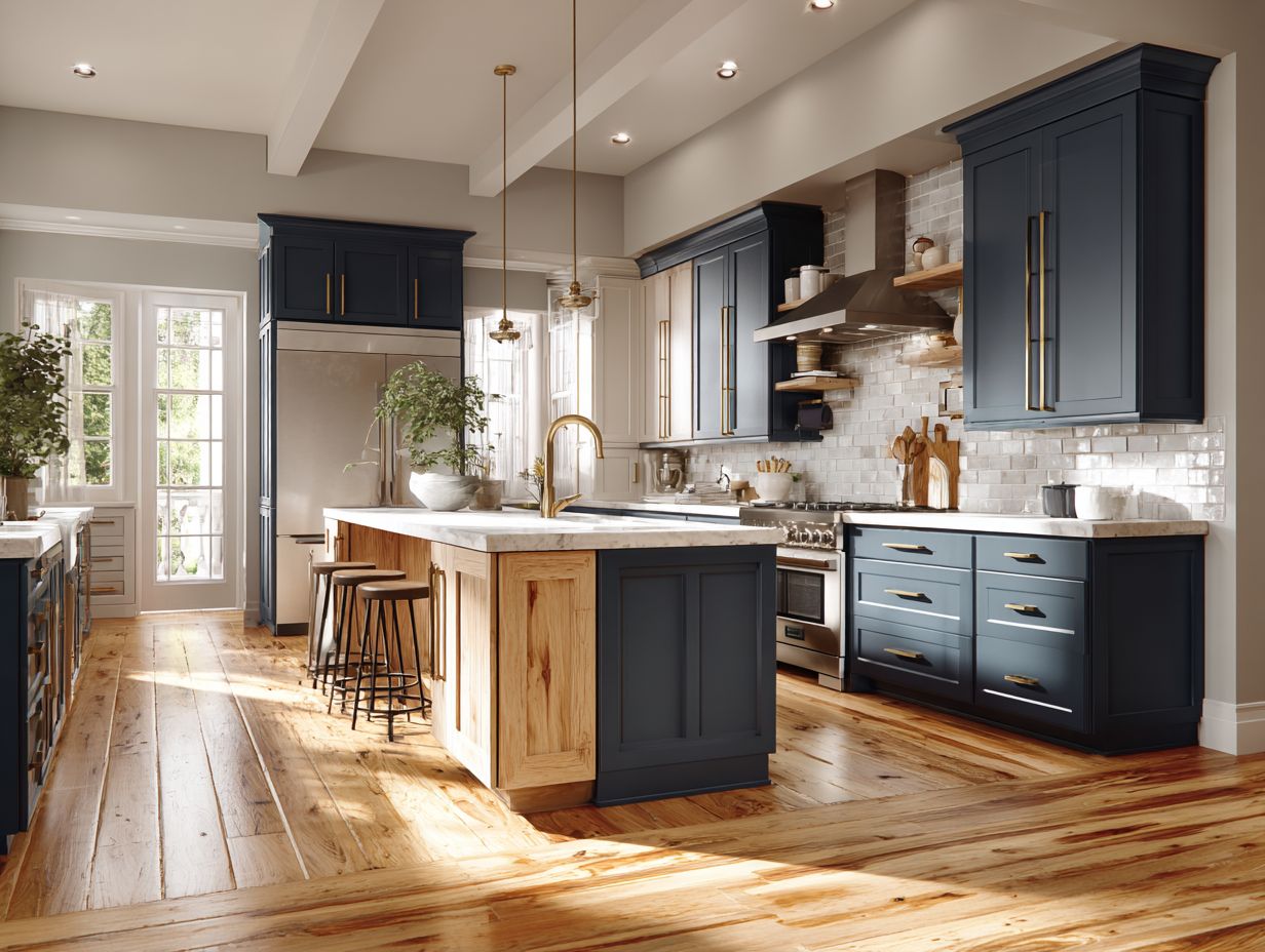
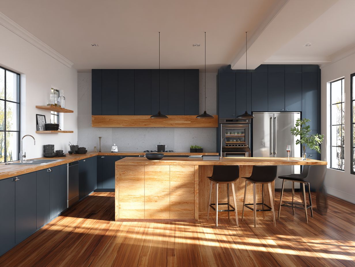
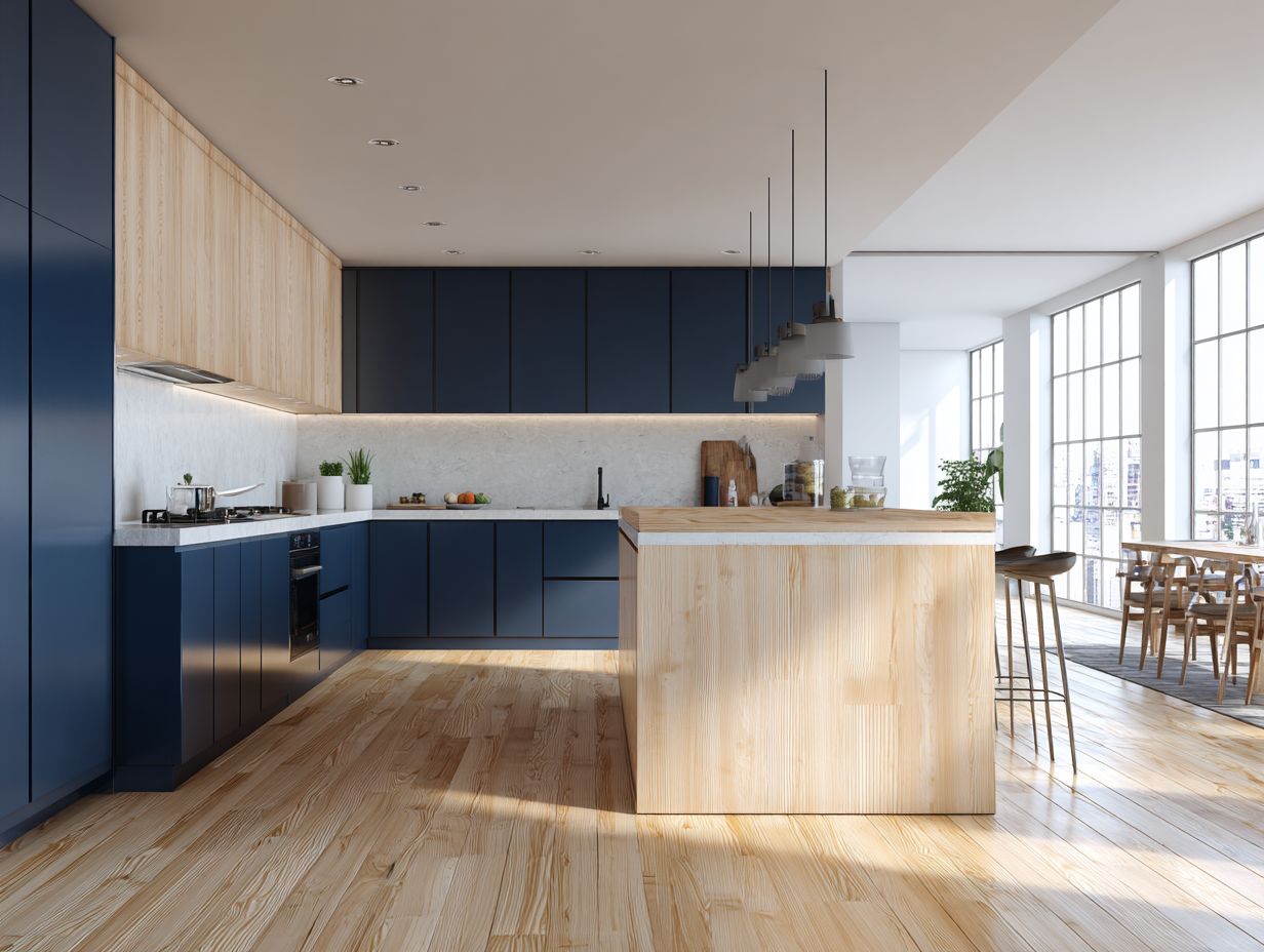
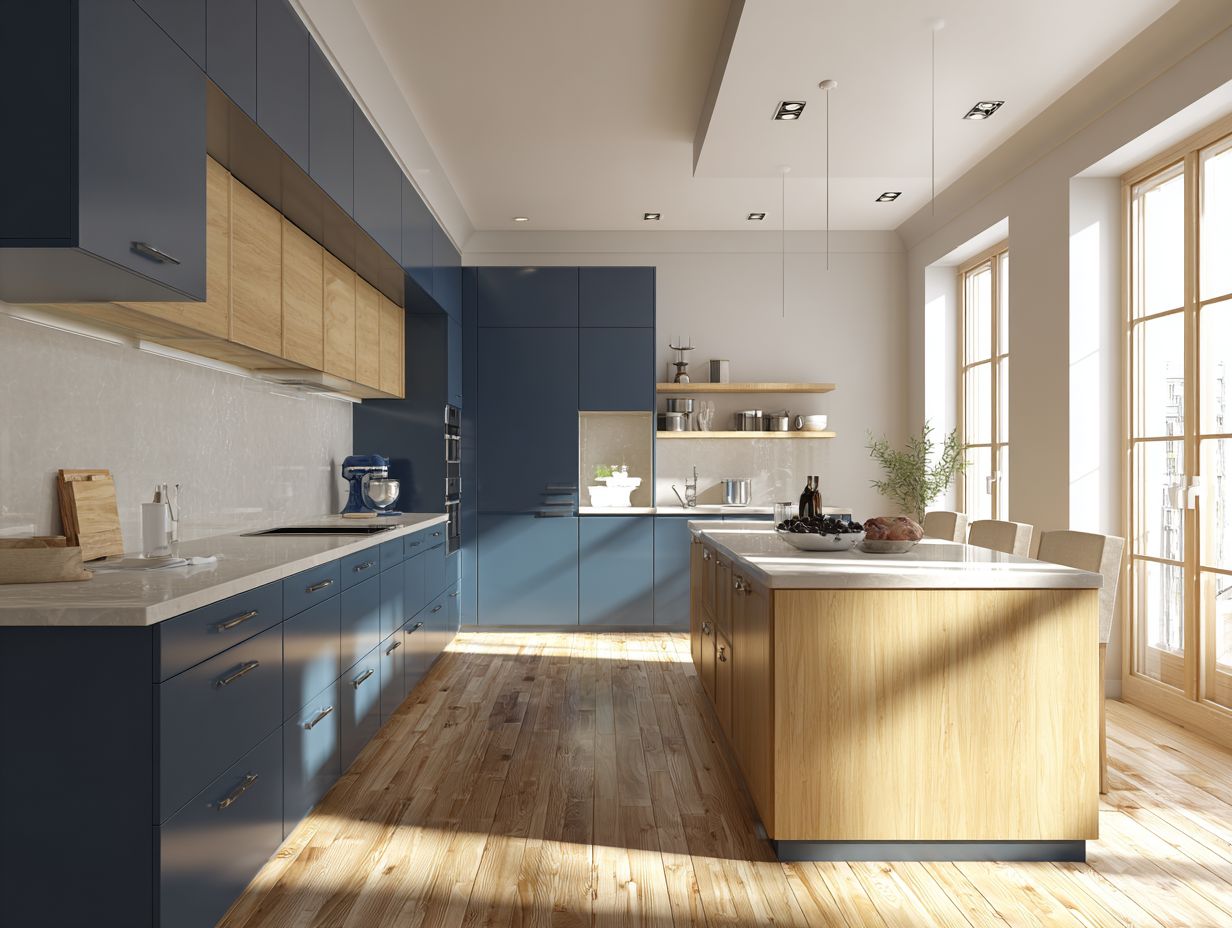
For example, you can pair white cabinets with a navy blue island to create a modern and stylish contrast.
Adding these touches to items like decorative bowls or wall art can improve the look and keep it unified.
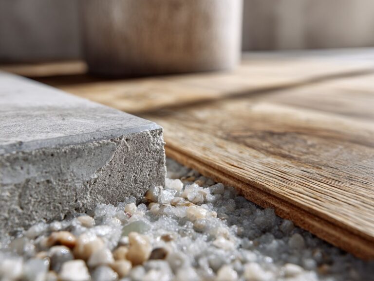
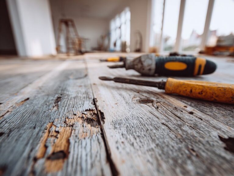
Types of Flooring Materials
Choosing the best flooring material is important for getting the look and use you want in both modern and farmhouse kitchens. This decision can significantly impact the home’s resale value, as mentioned in our analysis of flooring’s impact on home sale price.
Hardwood Flooring
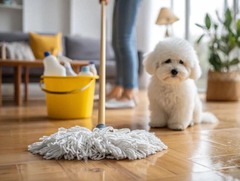
Hardwood flooring brings coziness and natural charm, making it a favorite option for homeowners wanting a timeless kitchen design.
One of the key benefits of hardwood flooring is its low maintenance requirement. Regular sweeping and occasional mopping with a wood-friendly cleaner can keep the floors looking pristine.
Hardwood works well with different types of cabinets; for example, dark walnut looks good with white or cream cabinets, while lighter oak looks good with dark cabinets.
Popular wood types include:
- oak
- maple
- cherry
Each is available in a range of finishes from matte to glossy. This versatility allows homeowners to achieve their desired aesthetic while ensuring durability for years to come.
Laminates and Vinyl
Laminates and vinyl flooring offer cost-effective solutions that mimic the look of hardwood while ensuring durability and ease of maintenance.
When choosing between laminate and vinyl, consider factors such as installation method, room suitability, and anticipated foot traffic.
Laminate flooring is simple to put in with a click-lock system, making it ideal for people who like to do home projects themselves. Vinyl, on the other hand, is more water-resistant and better suited for kitchens and bathrooms.
While laminate is generally more affordable (starting around $1.50 per square foot), high-quality vinyl options start at $2 per square foot. Weigh these considerations based on the specific needs of your space.
Tile and Stone Options
Tile and stone floors are durable and provide a wide range of design choices, making them a suitable option for both contemporary and traditional kitchens.
When choosing tile or stone for your kitchen, consider options like porcelain, which is available in various textures and colors and is resistant to moisture.
Natural stone, such as slate or granite, offers unique patterns but requires regular sealing to prevent stains.
For installation, make sure the subfloor is even and dry, as unevenness can cause cracking.
Maintenance typically involves routine sweeping and mopping, with occasional deep cleaning and sealing for stone surfaces to maintain their luster and longevity.
Types of Cabinet Finishes
The look and durability of kitchen cabinets can greatly impact their style and usefulness, affecting both how they are designed and how long they last.
Painted Cabinets
Painted cabinets allow homeowners and designers to quickly alter the kitchen’s appearance, which is why they are widely chosen.
Neutral shades like soft gray and creamy white are trending, providing a timeless look that complements various kitchen styles.
For a modern look, consider deep navy or forest green, which add a strong touch while remaining classy. Vintage kitchens often benefit from pastel colors like mint or blush, enhancing their charm.
When choosing a color, think about the overall design-light colors can brighten small spaces, while darker tones create a cozy, intimate atmosphere. Always test samples in your kitchen’s lighting to see how different colors interact with your decor.
Stained Wood Cabinets
Stained wood cabinets highlight the natural patterns of the wood, creating a cozy and welcoming atmosphere that works well with different styles.
Different stain colors can significantly influence how your kitchen feels. For a traditional appearance, think about using rich walnut. It adds warmth and makes rooms feel more inviting.
On the other hand, lighter stains like natural oak create an airy, modern ambiance. If you’re aiming for a contemporary vibe, shades like gray or black can bring sophistication while still showcasing the wood’s beauty.
Popular wood types include maple, known for its smooth grain, and cherry, which darkens beautifully over time. Each choice impacts color, durability, and maintenance, so choose carefully based on your needs.
Glazed and Distressed Finishes
Glazed and weathered finishes give cabinets more detail and personality, perfect for a vintage or farmhouse style.
To create a glazed finish, start by painting your cabinets in a base color, then apply a clear glaze mixed with a color like brown or gray for a subtle tint.
Use a brush or sponge to apply, ensuring even coverage. For a distressed look, sand edges and corners after base coat application to reveal underlying wood or paint layers.
Both methods increase visual appeal, especially when combined with rustic hardware or open shelves, resulting in a warm and welcoming kitchen feel.
Matching Strategies
Using good color matching techniques is important for creating a kitchen that looks good and works well. Understanding how different elements like floors come together can significantly impact the overall design. For instance, learning about matching existing floors through spot refinishing techniques can enhance the harmony of your kitchen’s aesthetics.
Complementary Color Schemes
Complementary color schemes use colors from opposite sides of the color wheel, creating strong contrasts that liven up kitchen spaces.
Using teal and coral together can make a lively and welcoming space. Consider teal cabinets with coral details such as dishware or small kitchen gadgets.
To effectively select colors, consider tools like Adobe Color Wheel or Coolors to visualize combinations. Test samples in natural light to see how they interact throughout the day.
Incorporating accessories like towels and art can further harmonize the scheme while allowing for seasonal updates without a complete overhaul.
Analogous Color Schemes
Analogous color schemes use colors that are next to each other on the color wheel, promoting visual harmony and a serene kitchen environment.
To create an analogous color palette, start by selecting a primary color, like soft green. Next, choose colors adjacent to it, such as light blue and muted yellow.
Use these colors in your kitchen by painting the walls a calming green, choosing light blue for the countertops, and adding yellow accents with items like dishware or towels.
Consider using these colors in cabinetry or tile backsplash to reinforce the theme. This unified method improves the look and creates a calm environment for cooking.
Monochromatic Approaches
Monochromatic approaches focus on variations of a single color, providing depth while maintaining a cohesive look throughout the kitchen.
To improve a single-color design, use various textures and shades. For instance, pair matte cabinetry with glossy tile backsplashes.
Consider using a soft gray as your base, then introduce darker charcoal for accents, and lighter shades like off-white for contrast. Accessories such as a woven rug or metal hardware can add tactile interest.
To avoid a dull look, use natural light; large windows can show the different tones in your color scheme, making the space inviting and keeping the design consistent.
Practical Tips for Selection
Using practical advice for choosing flooring and cabinets can simplify the design process and make sure your choices match your overall plan.
Creating a Color Palette
Having a clear set of colors helps you see how the kitchen will look in the end and makes sure all parts fit well together.
To create a color palette, start by gathering inspiration from various sources, such as magazines or online platforms like Pinterest.
Next, use online tools like Adobe Color to experiment with combinations and generate different palettes. Don’t forget about physical resources; color swatch books from paint brands provide tangible examples.
Once you’ve chosen a base color, experiment with complementary and accent shades. Document these selections in a digital note or sketchbook for easy reference during the design process.
Using Samples Effectively
Utilizing flooring and cabinetry samples allows you to assess color and texture in the actual kitchen environment, leading to better design decisions.
To effectively evaluate samples, follow these steps.
- Gather samples from various suppliers to compare different materials side by side.
- Examine them under different lighting conditions-natural light during the day and artificial lighting at night-to see how colors shift.
- Be sure to place samples against your current walls and adjacent finishes, as this helps visualize the overall design harmony.
- Consider using a digital tool like the Adobe Color app to create palettes and visualize combinations, ensuring your final choices complement each other perfectly.
Common Mistakes to Avoid
Avoiding common mistakes can help you save time and money during a kitchen renovation, ensuring it turns out well.
Ignoring Lighting Effects
Failing to consider the effects of natural and artificial lighting can lead to poor color choices that diminish the kitchen’s appeal.
To gauge how colors appear under varying lighting, start by painting a poster board in your chosen shades.
Place this board in the kitchen at different times of day-morning, afternoon, and evening-to observe shifts in hue. Consider using dimmable LED lights to mimic various lighting conditions.
When you do this, notice how warm light can make earthy tones stand out, while cooler lights may make blues and grays more noticeable. This detailed review will make sure your color choices improve the kitchen’s look.
Overcomplicating Color Choices
Overcomplicating color choices can create a disjointed look, detracting from the overall functionality and aesthetic of the kitchen.
To create a cohesive kitchen design, focus on a limited palette. Choose two to three main colors that complement each other.
For instance, pairing soft gray cabinets with white countertops can evoke a clean, modern look. Accent this with navy blue decor elements-like dishware or a rug-for a touch of sophistication. Tools such as color wheel apps can help visualize combinations.
Remember the effect of lighting; warm white bulbs can improve your selected colors, creating a welcoming environment without overpowering.
Frequently Asked Questions
1. What are some important designer rules to keep in mind when matching flooring to cabinet colors?
Some important designer rules to consider when matching flooring to cabinet colors include choosing complementary or contrasting colors, maintaining a cohesive style, and considering the overall aesthetic of the space.
2. Can I mix and match different types of flooring and cabinet colors in the same room?
Yes, you can mix and match different types of flooring and cabinet colors in the same room. Just make sure to maintain a cohesive look by choosing colors and styles that complement each other.
3. How can I create a cohesive look when choosing flooring and cabinet colors?
To create a cohesive look, choose flooring and cabinet colors that are within the same color family or have similar undertones. You can also use a color wheel to help guide your choices.
4. Should I match my flooring and cabinet colors exactly?
It is not necessary to match your flooring and cabinet colors exactly, but they should complement each other. You can use different shades of the same color or choose contrasting colors for a more unique look.
5. What types of flooring work best with dark cabinet colors?
Dark cabinet colors can be beautifully complemented by light hardwood or light-colored tile floors. Choose dark flooring with a different pattern or texture to make a strong visual impact.
6. How can I use various materials for my flooring and cabinet colors?
You can use a combination of wood, tile, and stone for your flooring and cabinet colors. Just make sure to choose materials that complement each other and maintain a cohesive look in the space.