Flooring and Wall Color Combinations – Fail-Safe Palettes
Picking the right colors for your floors and walls can change your room, making it look welcoming and trendy. Interior design professional Emma Deterding highlights the effectiveness of reliable color schemes, particularly those with warm neutral tones. This article will guide you through stunning color schemes that promise harmony and balance, ensuring your home reflects your personal style while remaining timeless. Check out the best matches for your upcoming renovation!
Key Takeaways:
Contents
- Understanding Color Theory
- Types of Flooring Materials
- Choosing the Right Wall Colors
- Fail-Safe Color Combinations
- Color Combination Trends 2024
- Room-Specific Recommendations
- Final Tips for Successful Combinations
- Frequently Asked Questions
- What are fail-safe palettes for flooring and wall color combinations?
- Why is it important to choose the right color combination for flooring and walls?
- What are some popular fail-safe palettes for flooring and walls?
- How can I add some visual interest to my flooring and wall color combination?
- What should I consider when choosing a fail-safe palette for my flooring and walls?
- Can I mix and match different styles with fail-safe palettes for flooring and walls?
The Importance of Color Coordination
Choosing the right colors is important because it impacts how people feel and view a space, making it either inviting or messy.
Studies have shown that certain color combinations evoke specific emotional responses. Blue colors can make a room feel peaceful, while bright reds can make it feel lively.
Designer Emma Deterding says that using matching colors makes spaces more comfortable and welcoming. This is especially clear in places like offices or homes, where a well-matched color scheme can increase productivity and help people relax.
Designers recommend using neutral backgrounds and adding colorful accents to create a balanced and uplifting space.
Overview of Popular Color Palettes
Popular color choices like warm neutrals, soft greens, and strong highlights can change a home from boring to lively.
Warm neutrals like soft taupe or sandy beige create a cozy atmosphere, often used by brands like Farrow & Ball in their ‘Wombat’ shade. Muted greens, such as the deep forest tones from Little Greene’s ‘Verdigris,’ bring a sense of tranquility to living spaces.
If you want to stand out, bright colors like ‘Dazzling Yellow’ from Farrow & Ball can bring life to a simple room. Visual references can be found on their websites, showcasing these palettes in beautifully styled interiors, helping you envision the impact in your own home.
Understanding Color Theory
Learning about color theory helps you pick great color combinations that make rooms look better. In fact, understanding flooring color theory can also make rooms appear larger, enhancing the overall aesthetic appeal of your space.
Primary, Secondary, and Tertiary Colors
Primary colors (red, blue, yellow), secondary colors (green, orange, purple), and tertiary colors offer a foundation for creating a cohesive color scheme.
Each color category plays a unique role in design. For example, primary colors are bright and lively, ideal for drawing attention.
Use red for call-to-action buttons on websites to increase user interaction. Secondary colors can complement or contrast with primary hues; green often represents health and can be effective for wellness brands.
Tertiary colors serve to add sophistication; a mix like blue-green can create a calming effect. Using these colors well can improve how things look and help users interact easily.
Consider creating a mood board to visualize combinations before finalizing your design.
Warm vs. Cool Colors
Warm colors create a sense of energy and comfort, while cool colors encourage calm and peace, so choosing them carefully affects the mood.
In spaces like living rooms, warm colors such as rich reds or golden yellows can create an inviting atmosphere, perfect for social gatherings.
Meanwhile, for bedrooms, using cool colors like light blues or greens encourages relaxation and helps improve sleep quality.
For example, a pastel blue accent wall in a bedroom can contrast beautifully with warm-toned furniture, balancing energy and serenity.
When redesigning spaces, consider each color’s emotional impact to achieve the desired ambiance while promoting overall well-being.
Neutral Colors and Their Versatility
Neutral colors provide a plain backdrop, allowing you to include various accent colors without making the area feel cluttered.
For example, combining oak floors with pastel walls makes a calm space, letting you choose lively furniture like a burnt orange sofa or dark blue cushions.
Incorporating elements such as charcoal gray throws or metallic gold accents introduces depth and personality. Consider using neutral artwork to unify the design.
By combining these elements, you can create an inviting space that looks good and functions well, showing that neutral colors can be a great base for brighter accents.
Types of Flooring Materials
Selecting the right flooring is important to match wall colors and create a unified design style. For those looking to achieve a high-end aesthetic without breaking the bank, consider exploring budget flooring that looks expensive with designer tricks.
Hardwood Flooring
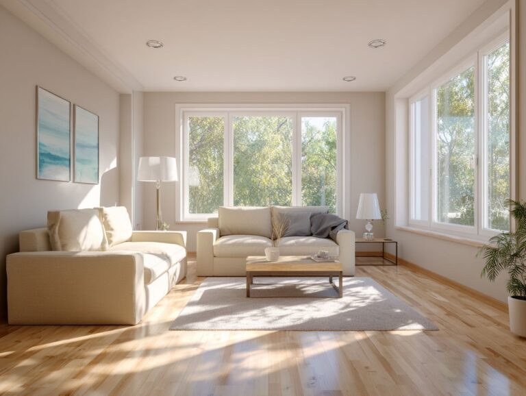
Hardwood flooring offers timeless elegance, with shades ranging from light oak to rich mahogany that can beautifully complement wall colors.
When picking wall colors to go with hardwood floors, think about soft, neutral shades like creamy beige or light grey, which make the wood’s natural warmth stand out.
For a stronger appearance, deep blues or forest greens create striking contrasts, especially with darker woods like walnut.
Using bright whites adds a fresh, modern touch that works well with lighter oak or maple floors. Balance is important; choose colors that create a sense of harmony and improve the look of your room.
Laminate Flooring
Laminate flooring is an affordable choice that looks like real wood and offers a wide range of color options.
This flooring type works beautifully with a variety of wall colors. For instance, pairing warm neutral walls-like beige or taupe-with lighter laminate can create a cozy, inviting atmosphere.
Alternatively, darker colors like navy blue or deep green can stand out well against medium to dark laminate shades, providing a modern look.
Using accent rugs can improve the look by adding comfort and color to match your chosen palette.
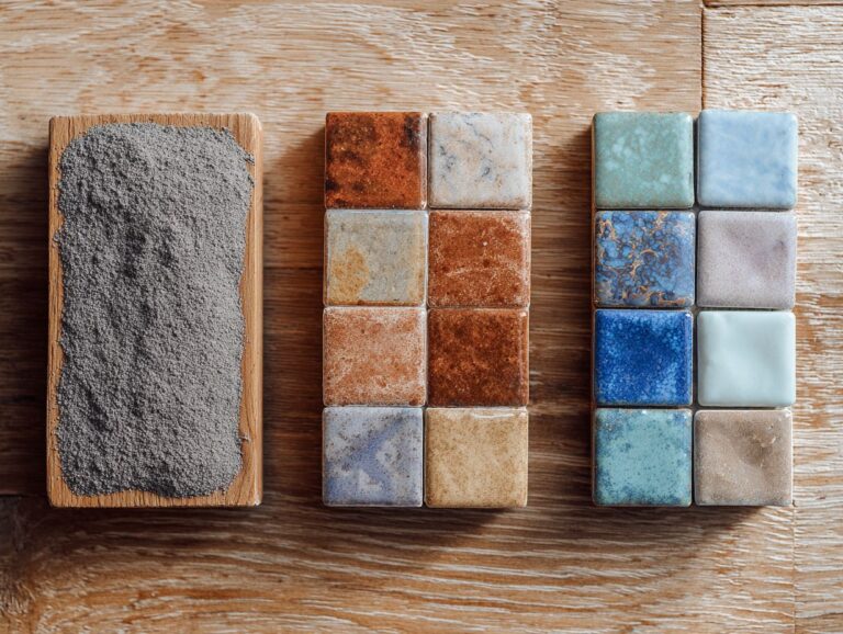
Tile Flooring
Tile flooring comes in many styles, colors, and textures. It’s great for both looking nice and being useful in busy places.
Ceramic tiles are widely used because they can be used in many ways and are affordable, while porcelain tiles last longer, which makes them suitable for areas with high moisture.
To create harmony, consider pairing light ceramic tiles with warm wall colors like soft beige or creamy white, which brighten spaces. For a more sophisticated look, choose dark porcelain tile with rich colors such as deep navy or charcoal gray on the walls.
These combinations make the tile more attractive while keeping a consistent design across the room.
Carpet Options
Carpet choices vary from gentle pastels to striking patterns, adding warmth and comfort while improving the room’s color theme.
Choosing carpet colors involves aligning with your wall and flooring selections.
For neutral walls, choose bright carpets in red or blue to make a central feature. If your flooring is textured, opt for solid colors to avoid overwhelming the space.
Incorporating patterns can add interest; for instance, a geometric carpet works well with modern decor, while florals complement traditional designs.
Always test samples in various lighting conditions to observe how they mix with current colors and designs before deciding.
Choosing the Right Wall Colors
Choosing the right wall color is an important part of creating a consistent and welcoming interior design that matches your ideas. Understanding the relationship between different design elements, such as flooring and cabinet colors, can be crucial. Our comprehensive guide on matching flooring to cabinet colors provides designer rules that can help you achieve a harmonious look.
Understanding Undertones
Knowing the underlying tones-warm, cool, or neutral-can greatly impact how wall colors work with flooring and decor items.
To choose the right wall color, start by determining the undertone of your existing elements. For instance, if you have warm wood flooring, consider warm colors like buttery yellows or soft peaches; these create harmony.
On the other hand, cool-toned gray floors pair beautifully with soft blues or icy greens for a refreshing look. If your decor includes neutral colors like creams or taupes, try using shades such as sage green or dusty rose to make the space more lively without causing any color conflicts.
Make sure to try out samples on the wall and look at them under different light to see if they match your color scheme.
Accent Walls: When and How to Use Them
Incorporating accent walls can add depth and character to a room, drawing attention to specific areas and enhancing design cohesion.
To select the perfect colors and patterns for your accent walls, consider these tips:
- Pick a strong color that matches the main colors in the room, like a dark navy blue with light gray.
- For patterns, opt for subtle textures like herringbone or stripes to maintain sophistication without overwhelming the space.
- Placement is key; accent walls work best behind focal points like fireplaces or beds.
- Keep your colors coordinated by matching with the colors you already use in your decor. Use tools like color palette generators to see how different colors look together.
Fail-Safe Color Combinations
Some color combinations are consistently reliable, offering a timeless appearance.
Classic Combinations
Classic combinations like navy and white or beige and brown create a sophisticated backdrop that remains stylish across trends.
One timeless pairing is gray and yellow, perfect for modern living rooms. Paint the walls gray and add yellow items like cushions or artwork for a lively feel.
Another stylish pair is black and gold, perfect for dining rooms. Think about black furniture paired with gold decorations for a rich feel.
Pastel pink and mint green work beautifully in bedrooms, offering a soft and calming atmosphere; think mint walls with pastel pink bedding for a harmonious retreat.
Using these combinations carefully creates a unified and attractive area.
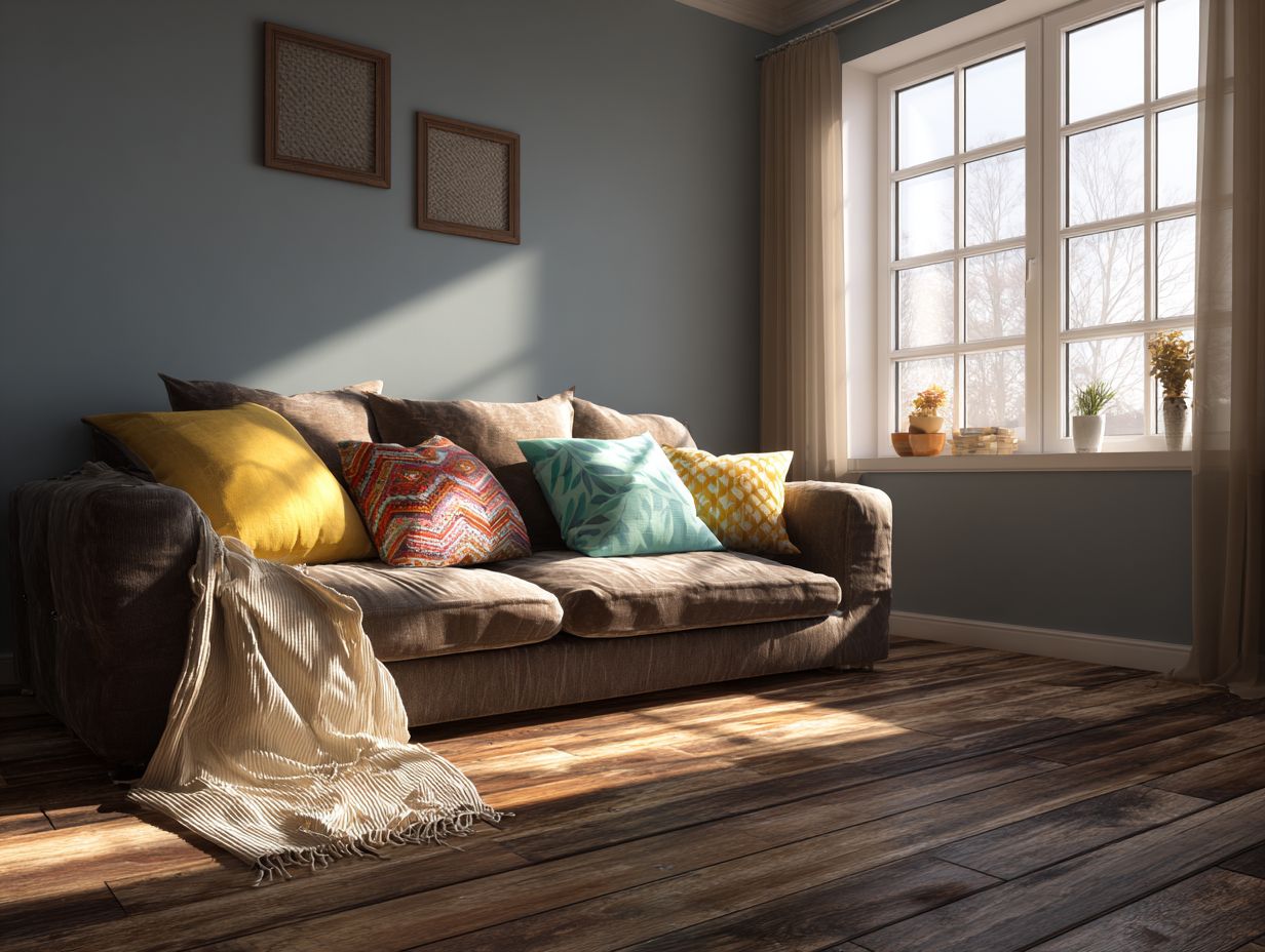
Modern and Trendy Palettes
Modern color schemes often use strong colors and unusual combinations that make spaces lively and full of energy.
To use colors like teal and aubergine well in home decor, think about painting one wall in a room with one of these colors. Teal works beautifully in living rooms, paired with neutral furnishings for balance.
Aubergine, on the other hand, adds a rich depth to bedrooms, especially when accented with gold or brass decor elements.
Using throw pillows or area rugs in these colors allows for easier updates. For a seamless look, integrate these hues with complementary tones such as soft grays or cream to create a cohesive and inviting atmosphere.
Color Combination Trends 2024
Color Combination Trends 2024
Fashion and Design Color Trends: Trending Colors by Popularity
Fashion and Design Color Trends: How Colors are Used in Design
The Color Combination Trends 2024 Data shows interesting trends in changing fashion and design preferences, focusing on which colors are popular and how designs are used. These statistics are instrumental for businesses and designers aiming to align their creative strategies with current consumer trends.
Fashion and Design Color Trends data reveals the popularity of specific colors. Brat Green is seen as the dominant color of 2024, indicating an inclination towards earthy, natural tones that evoke calmness and sustainability. In contrast, Barbie Pink was important in 2023, showing a fun and colorful style that connects with themes of nostalgia and youthfulness. Looking forward, Piercing Canary It is expected to be important in 2025, indicating a move towards bright and strong colors that grab attention and encourage creativity.
- Design Usage Insights: 48% of small businesses Businesses are spending money on marketing with popular colors to draw in and connect with customers by using attractive color schemes. Additionally, 35% of designs feature Orange Peel Garnish, a warm and energetic hue, highlighting its versatility in adding vibrancy to various projects. Meanwhile, 29% of designs utilize Hyperpop Palettes Featuring neon and varied colors, highlighting a move towards trying new things and daring expression in creative areas.
Using colors like Brat Green and Orange Peel in design shows a trend of mixing natural and active elements, providing a balanced look in visual design. This data shows that using these color trends can greatly improve design effectiveness and attract consumer interest.
Ultimately, the Color Combination Trends 2024 Data highlights the need to pay attention to popular colors and new design ideas. By using these ideas, designers and businesses can connect with their audience and stay competitive in a fast-changing market.
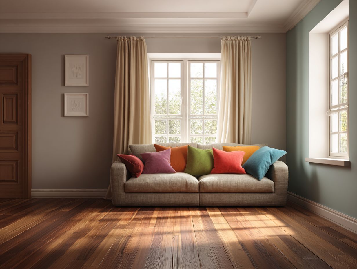
Eclectic and Bold Choices
Using a mix of strong and unique colors can show off your personality and creativity in your home.
To effectively mix colors and patterns, start with a color wheel to identify complementary and analogous colors.
Using deep teal with mustard yellow results in a lively and balanced appearance. Designers like Ruth Mottershead often blend floral patterns with geometric prints, striking a balance that feels intentional rather than chaotic.
Use a neutral base, like gray or beige walls, to make your bright colors stand out. By incorporating these methods, you can create spaces that are both eclectic and cohesive.
Room-Specific Recommendations
Different rooms require specific color schemes based on their use and mood, enabling customized design choices. Worth exploring: Matching Flooring to Cabinet Colors – Designer Rules
Living Room Ideas
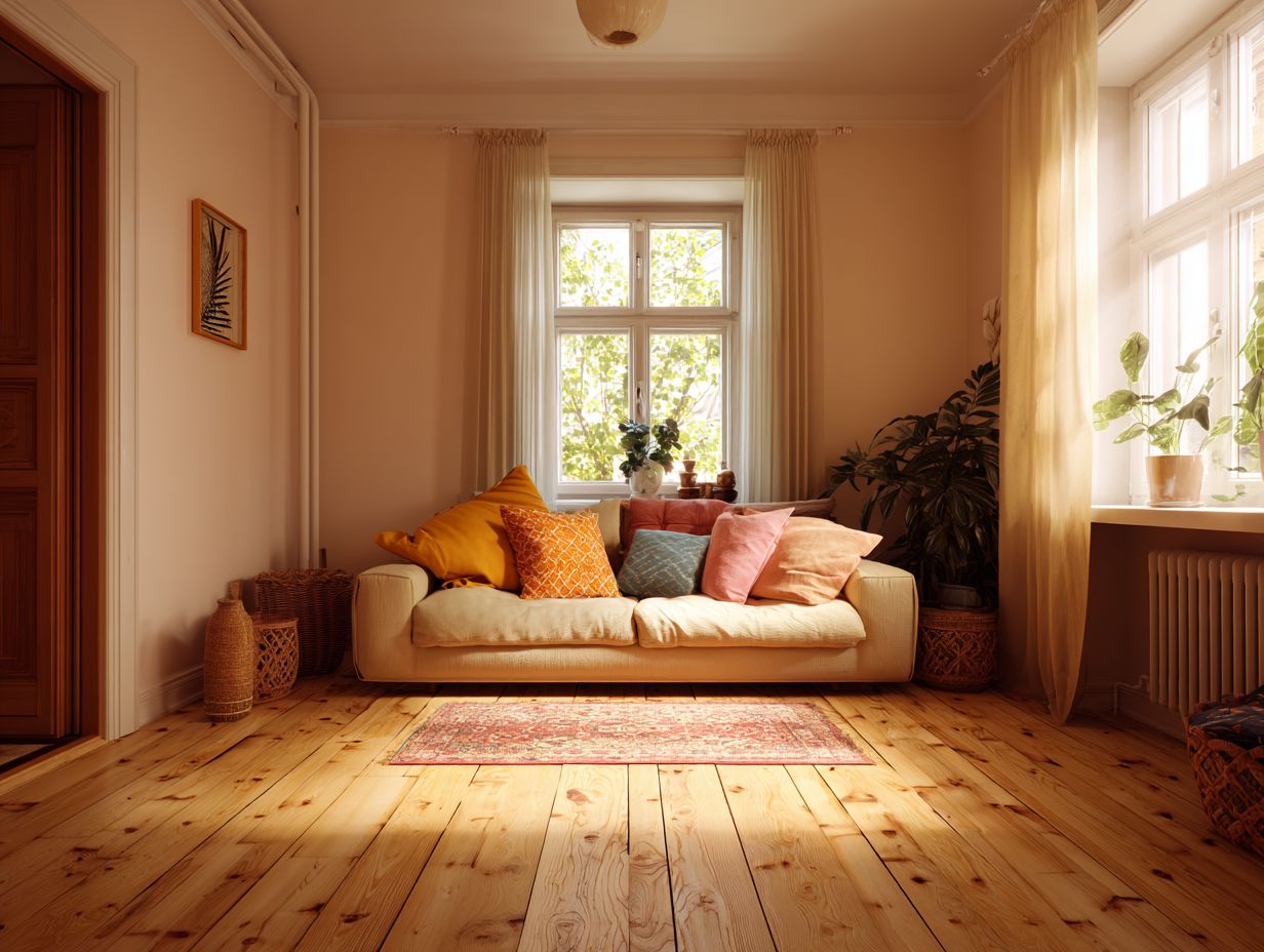
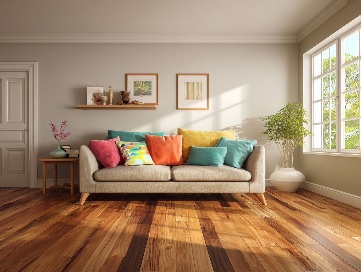
For living rooms, using warm neutral colors with bright touches can make a comfortable space that encourages relaxation and talking.
To achieve this aesthetic, consider using a soft beige or taupe for the walls, which provides a calming backdrop.
Then, use colorful accessories; for example, deep teal or mustard yellow throw pillows can brighten up a neutral sofa. Pair these with wooden furniture, like a reclaimed coffee table, to add warmth.
Remember the lighting-lamps with bulbs that give off a warm color can make a room feel cozy. Positioning mirrors thoughtfully can reflect sunlight, making the space appear larger and brighter.
Bedroom Color Schemes
In bedrooms, color schemes should promote a calming atmosphere, often achieved through soft pastels and earthy tones.
For a serene ambiance, consider pairing light blue walls with white trim. This combo creates a fresh, airy feel reminiscent of the sky.
A calming sage green can be paired with natural wood details to create a link to the outdoors. To improve relaxation, add soft cream curtains and bedding, creating a warm contrast.
Experts suggest using matte finishes over glossy ones to prevent distraction and achieve a more harmonious look. Try these mixes to see what matches your own feeling of calm.
Kitchen and Dining Combinations
Kitchens and dining areas work well with lively colors like warm yellows and bright greens that make people feel hungry and talkative.
To effectively implement these colors, consider painting the walls a soft buttery yellow, which can create a welcoming atmosphere. Add bright green touches, like chair cushions or decorative dishes.
Alternatively, balancing soft turquoise or seafoam green with warm wood tones can evoke a fresh yet cozy feel. Experiment with lighter hues for smaller spaces to avoid overwhelming the room, using accessories like table runners or fresh produce as pops of color that keep the mood lively and inviting.
Final Tips for Successful Combinations
Picking the right colors takes careful thought and a close look at details to make sure they all go together nicely.
Testing Colors with Samples
Testing colors with paint samples allows homeowners to visualize how different hues interact with lighting and furnishings before finalizing choices.
To effectively test colors, start by applying sample swatches on your walls. Observe them in different lighting-morning sun, afternoon shade, and evening artificial light-to see how they change.
Consider using a color visualization app like Sherwin-Williams ColorSnap to simulate how colors will look in your space. Remember to pay attention to the room’s decoration; a color can look brighter when placed next to plain furniture compared to bright decorations.
Wait 48 hours to fully evaluate the color before deciding.
Frequently Asked Questions
What are fail-safe palettes for flooring and wall color combinations?
Fail-safe palettes are color combinations that are universally appealing and are known to work well together in interior design. These palettes provide a safe and reliable option for those who are unsure about which colors to pair for flooring and walls.
Why is it important to choose the right color combination for flooring and walls?
The right color combination for flooring and walls can greatly impact the overall aesthetic and mood of a room. It can create a unified and balanced appearance, making the area more welcoming and nice to look at.
What are some popular fail-safe palettes for flooring and walls?
Some popular fail-safe palettes for flooring and walls include neutral shades like beige and gray, complimentary colors such as blue and orange, and monochromatic schemes using different shades of the same color.
How can I add some visual interest to my flooring and wall color combination?
You can add visual interest by incorporating a pop of color through accessories, such as throw pillows or artwork. Textured materials, like a patterned rug or wallpaper, can also add depth and dimension to the space.
What should I consider when choosing a fail-safe palette for my flooring and walls?
Consider the size and lighting of the room, as well as the existing furniture and decor. This will help you determine the best color combination that will complement the space and create a cohesive look.
Can I mix and match different styles with fail-safe palettes for flooring and walls?
Absolutely! Reliable color schemes work well with different design styles. By using a neutral base and adding touches of color or patterns, you can create a distinct and personalized appearance while still keeping the reliable color scheme.